


Last week I had the opportunity to meet the team of American Apothecary. Head designer Anastasia Fokina, owner Mathew Kronenberg, and head of PR John Thompson II.
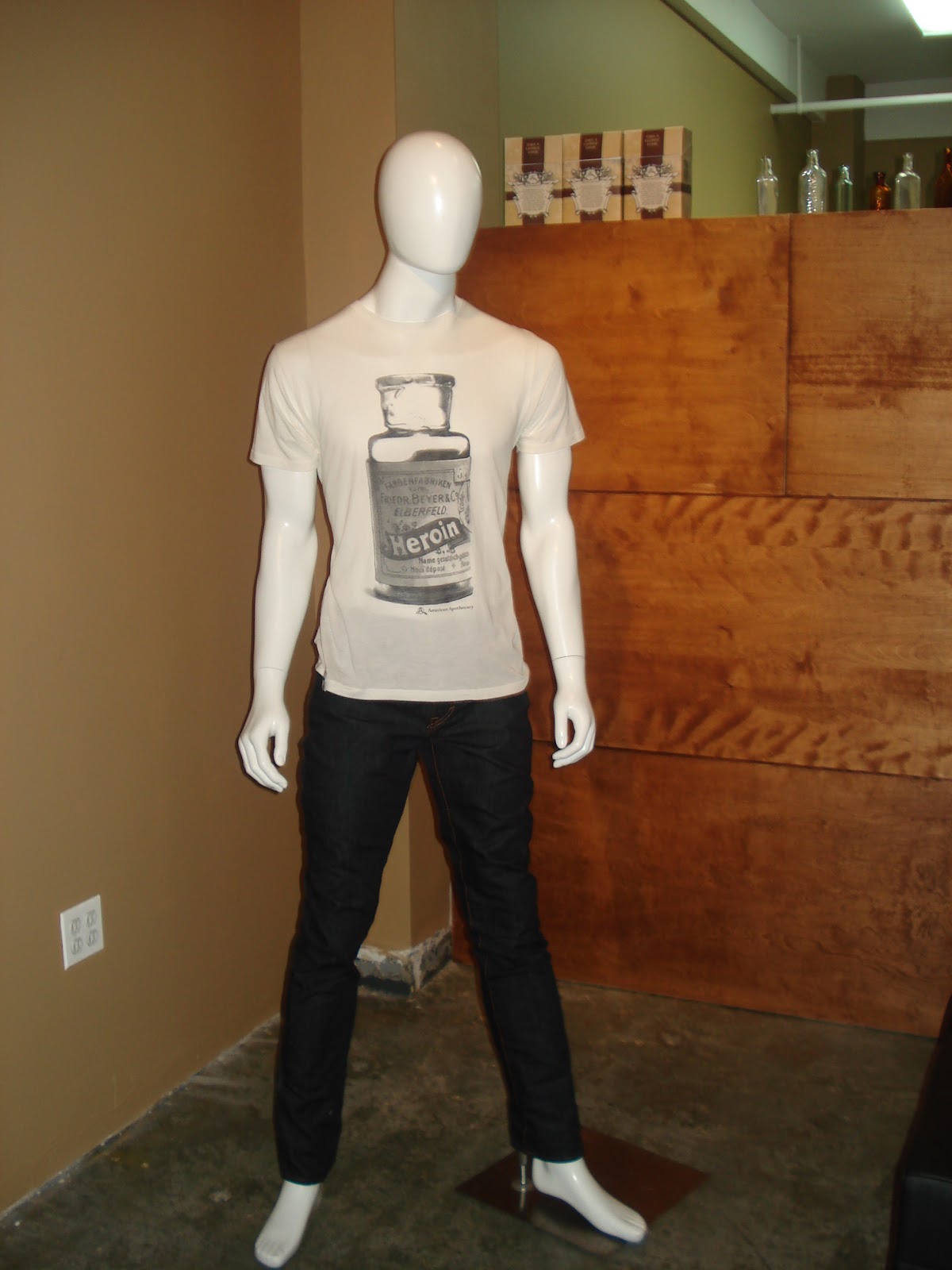
American Apothecary is a new T- shirt brand that is not only popular for comfortable style but for the message that they are trying to promote to the rest of the world. Their tag line, "Take a Closer Look" was created to wake people up about what they put in their bodies. What may seem ok now might be considered harmful in the future.
1) How did you come up with the concept for your T-shirt brand?
Mathew Kronenberg: My partner Jeremy Sziklay. studied Psychology as an undergraduate student. There he learned about medicine and prescription drugs; which inspired the idea for the T-shirt brand; Apothecary means pharmacist. When people are worried about their health they trust their doctor, believing that they will prescribe something that is not harmful to them. It was very interesting, there used to be a time where you could go to your local pharmacist and they would prescribe Heroin for back pain. We are not promoting drugs, we are not against prescription drugs, and we are not trying to tell people what they should do with their bodies. We want people to educate themselves before using products. People should do their research before taking something just because their doctor says it’s ok.
Anastasia: We want to educate people not just with medicine but with food, cosmetics, or anything else that could be harmful to your body. We want people to be socially aware. 10% of our profits go towards drug outreach programs.
2) Comparing last season spring 2010 collection to the new collection for spring 2011, what would you say is different?
Mathew: The concept is still the same; there are a large variety of vintage images out there that we can use for creating new tees. We started our collection with T-shirts because we thought that it would be the best way to get our message across. We could have started out with scarves or denim, but graphic T-shirts helps us get our message out to people. T-shirts is something that everyone can wear, and is not just targeted to a small group of people.
Anastasia: When describing the brand I use the 3 F's Fabric, Fit, and Feel.
The fabric feels nice, it’s soft and comfortable. Our shirts are made out of pima cotton, we use water based screen print, and they have a European fit. European fit is great because the shirt is not too big and it’s not too tight it fits like a glove on the body. For spring 2011 we are coming out with the V-neck shirt for women's. For fall 2011, we will be introducing long sleeve tops as well.
Mathew: We are planning a scavenger hunt to launch our jewelry line in December and we are also designing scarves to add to the collection.
Anastasia: We are eco-friendly so we wanted the packaging to be recyclable. We want to help improve the environment. New packaging is planned for 2011. We want to package the merchandise using vintage glass bottles like "a message in a bottle"
3) Why do you think your brand stands out from all the other graphic T- shirts brands?
Mathew: Fashion is mainly about expressing yourself and can be superficial. We are all about sending out a message. We want people to become more aware of what they put in their bodies.
American Apothecary was just started in February 2010 and is already making a great impact on the fashion industry. American Apothecary is located at "The Prince of Soho”
4A Prince Street New York, NY 10012 212.966.3921: www.princeandelizabeth.com. You can also purchase merchandise online at their website: http://www.a-apothecary.com/
Congratulations to the new t-shirt brand=)
ReplyDelete